1. Potentially change opening view of the world map
Instead of having a view of the entire world as the first view, I recommend zooming in on a specific piece of land at the start (i.e., like NextEarth). One idea is to choose a different area of land to zoom in on each time a user opens the GeoWeb map (maybe not completely random, but you could develop a list of popular cities or monuments to randomly select from). The rationale is that the world is so big that it is easy to forget about different areas of land or even regions. By defaulting to a random parcel of land each time, it might nudge the consumer to look in that particular area of land or region. If you do this, it might be useful to explain to the user the rationale behind this in a simple note on the home screen.
2. Default to satellite view Instead of basic map view
Personally, I think it makes the experience more real because I can see the actual monuments, buildings, houses, etc. However, this is just my preference, so it might be useful to survey users about which view they prefer (if you haven’t already done that).
3. Add tutorial
I recommend adding a tutorial on how to use the platform for first-time users (with the ability to skip of course).
4. Add a zoom button or slider
I know it isn’t too difficult to zoom in and out by using your fingers on a laptop trackpad or by using a mouse, but the functionality might not be obvious to new users. Therefore, it might be useful to either add “+/-” zoom buttons or possibly a zoom slider.
5. Re-think how to display purchased land
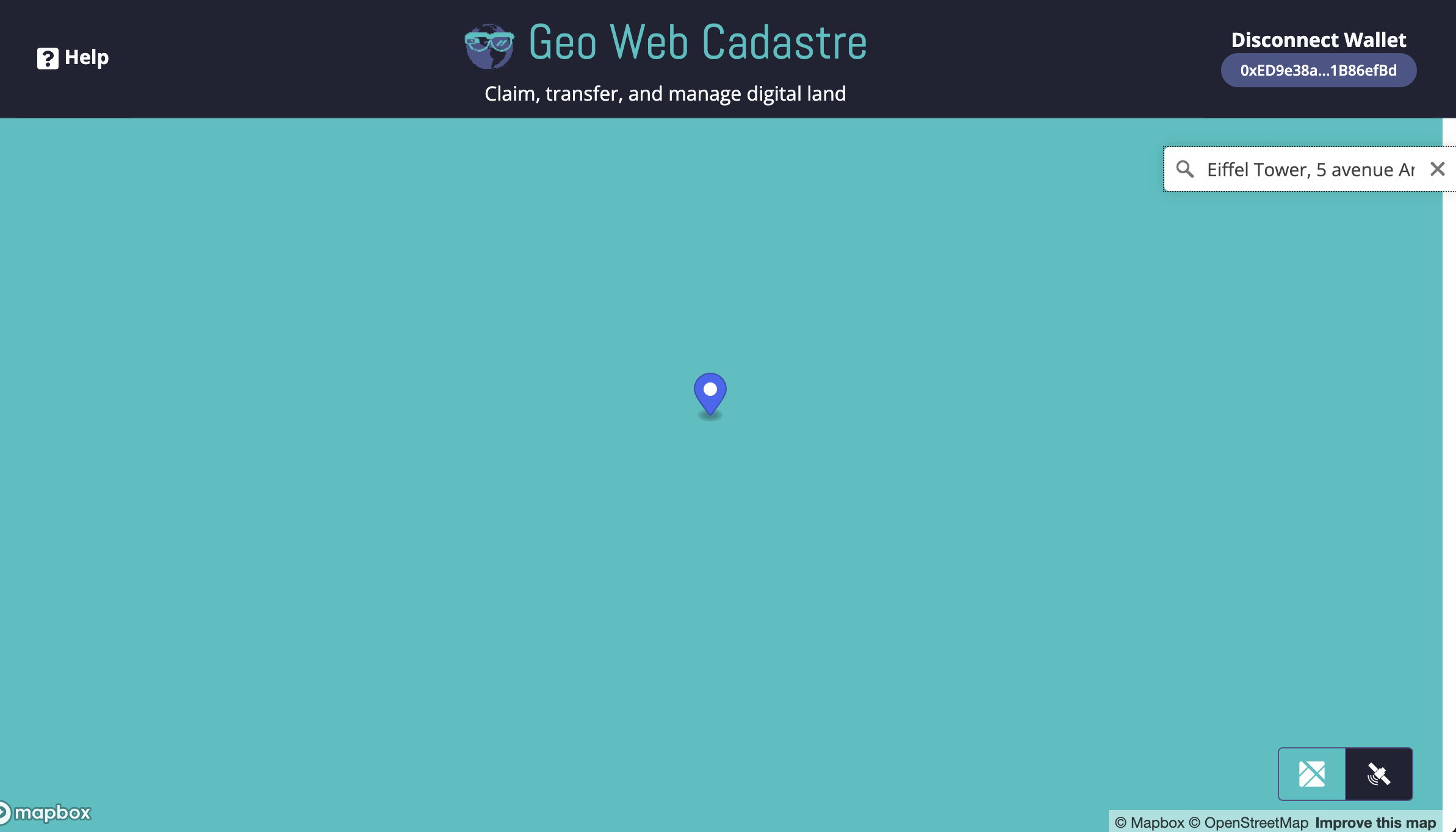
Currently, when hovering your mouse over a purchased parcel of land, the parcel is highlighted in solid blue. When searching for land in a popular area, the user might only see this solid blue picture (because their pointer is likely still on the screen after searching for land). This happened to me when I searched for the Eiffel Tower; the map zoomed in and the whole screen went blue (see picture below). It took me a bit to figure out what was going on. There are many ways to re-design this and I can try to think of a few ways IF everyone agrees on the change.
6. Coordinate squares always displayed?
This isn’t exactly a recommendation because I do not know whether it is better to display the coordinate squares at all times, or if it is best to keep it the way it is (appears only when the land is clicked on). However, being a novice to the platform, I did not immediately understand how to get the coordinate squares to appear. A tutorial might solve this issue though.
7. Add further instruction on how to escape from “Claim Mode” and/or create more ways to exit "Claim Mode"
I think escaping from “Claim Mode” is pretty easy (either by clicking elsewhere on the map or clicking ESC on keyboard), but the instruction might need to be even clearer. To elaborate, when sizing your parcel of land, there IS instruction to “Hit ESC to exit claim mode.” However, that instruction disappears when the parcel of land is selected. It would be useful to keep the instruction on the page even when land is selected. Another way to exit claim mode could be to click on the search bar again. For this to happen, the search bar would need to be added back on the screen when the land is selected. This is a pretty nit-picky recommendation, but I think it is important to design the interface so that no users will have any questions or problems while using the platform.
8. Glitch on yellow-highlighted claimed land when zooming in?
When zooming in on a potential claim of land, the yellow squares slightly glitch (see picture below). I am not sure if this is just a glitch on my browser? If it is a glitch, you might want to look into fixing. It is not a major problem though if fixing it proves to be too cumbersome.
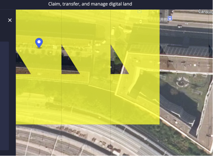
 . We’ve known about it but hadn’t got around to fixing it. Always good to pay attention to detail–all part of the overall feel of the product.